Cinemark Paraguay - Website Redesign
Cinemark is a movie theater chain with operations in the United States and a large part of Latin America.
Currently, Cinemark has 2 movie complexes and 15 screens in Paraguay. One of them is located in one of the most important commercial areas of Asunción, the capital of the country, and the other in Ciudad Del Este, the commercial capital of Paraguay.
Asunción, Paraguay
2015
Entertainment
600+
Challenge
The app had a cluttered interface, making it difficult for users to navigate and find essential features. Users were facing issues with the onboarding process, which was affecting new user adoption rates. The app lacked personalization and customization options, making it less engaging and user-friendly.
Results
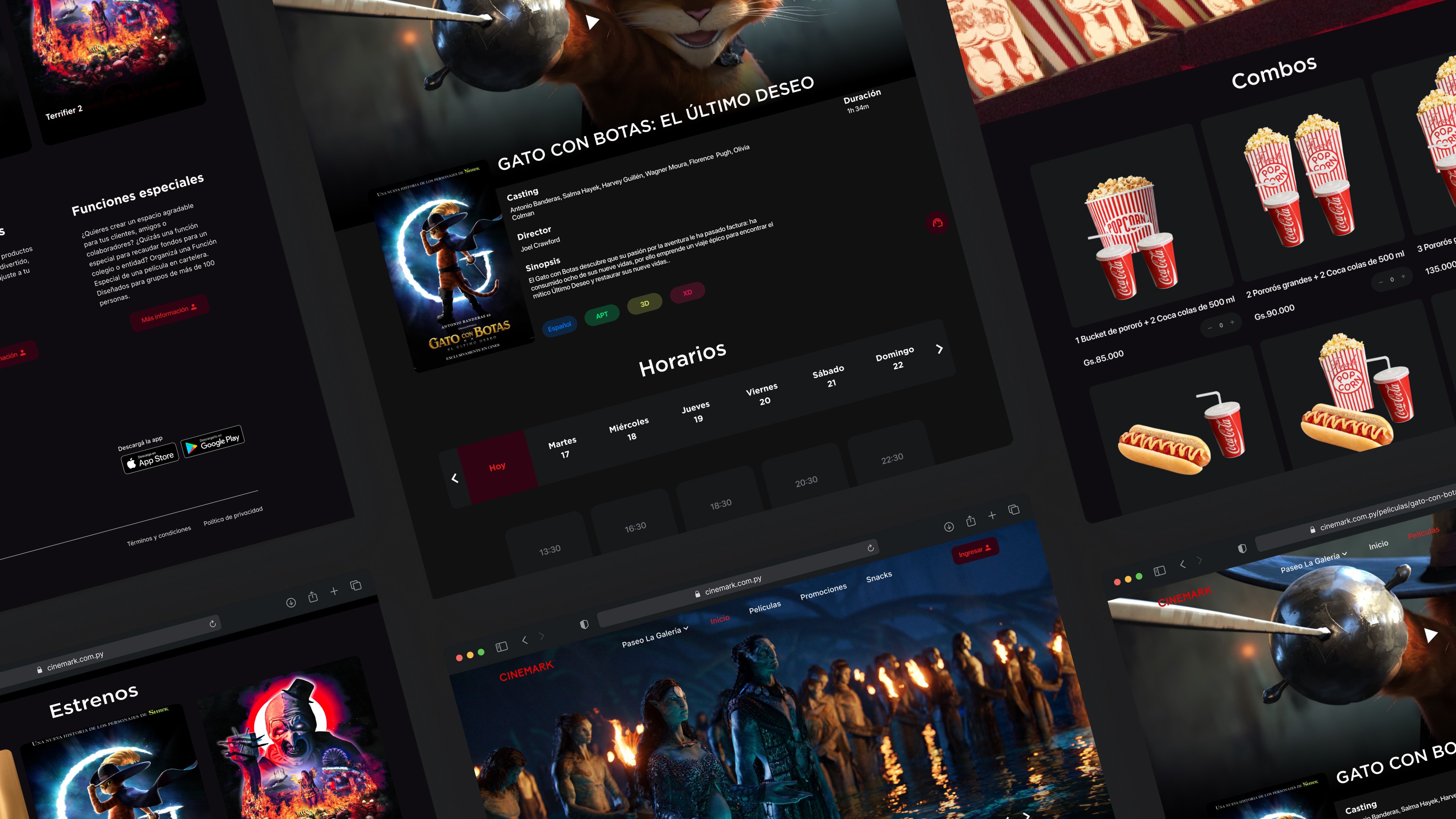
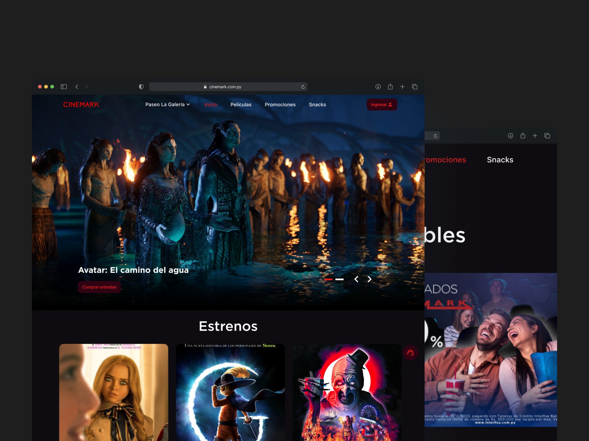
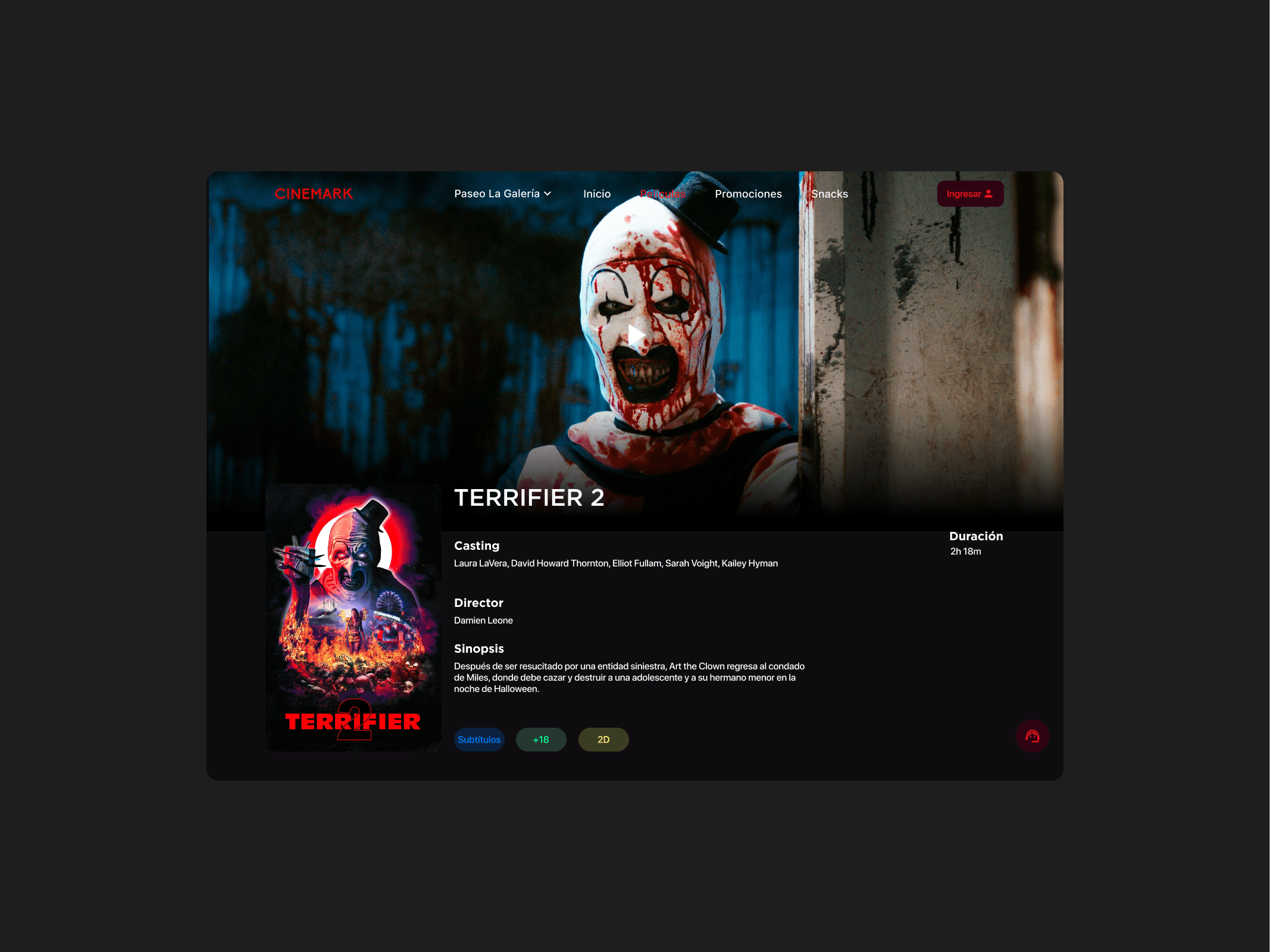
The redesign of the Cinemark Paraguay website has been a success thanks to the implementation of various improvements in the user interface, ease of use, content optimization, and adaptation to mobile devices.
These changes have helped to improve the browsing experience for the user, allowing for a simple, fast, and easy-to-use experience.
35%
Improved onboarding process
25%
Increase in user retention
84%
Increase in time spent on website
Process
Research & Analysis: We conducted user interviews, surveys, and analyzed in-app analytics to understand the pain points and user needs. We also studied competitor apps and industry trends to gather insights
Information Architecture: Based on the research findings, we restructured the app's navigation and content, prioritizing features and information according to user needs.
Wireframing & Prototyping: We designed low-fidelity wireframes to visualize the new layout and navigation, iteratively refining them based on user feedback. Afterward, we built a high-fidelity, interactive prototype to test the design.
Usability Testing: We conducted usability tests with a diverse group of users to validate the design and identify areas for improvement. Based on the feedback, we made necessary adjustments to the design.
Visual Design & Style Guide: We developed a cohesive visual language, including color schemes, typography, and iconography, ensuring consistency throughout the app. We also created a style guide to maintain design consistency in future updates.
“ With our new visual branding and language in place, the new Shopify brand clearly captures the essence of our current and target customer base, our employees, and our values. ”
Tobias Lütke
CEO, Co-founder | Shopify
Conclusion
The StreamLine mobile banking app redesign successfully addressed the usability issues, resulting in a more intuitive and user-friendly experience. The improved UX/UI design led to increased user adoption, engagement, and satisfaction, demonstrating the value of a well-designed template for UX designers.
